

Renting may come with its freedoms, but one of the main things that really got me excited about buying our own home, was the chance to make it ours. Nails in walls where we wanted them, walls in muted colours, and decor that fit the aesthetic of the home that we were trying to create.
Over the last few months, I’ve been keeping an eyes peeled for homewares and decor items that will truly make our house feel like a home. Perhaps the thing that really stopped me from investing too much in new decor while renting, was the unknown as to whether it would be the right ‘fit’ when we finally purchased a house of our own – something I’ve quickly learnt was a wise decision. As we’ve been mapping out the renovations that we have upcoming, and the renovations that we’d love to do in the years that follow, I’ve finally settled on a home decor style that will complement the energy of the house, rather than feel completely out of place, and I thought I’d share some of the bigger items that we’re looking to invest in now that we’re settled into our space.
When we first moved to Sydney, we arrived with only a couple of suitcases each and the clothes on our back. All of the furniture that we’d bought from previously renting together was lost to arson, so we were essentially starting from scratch. And the insurance barely contributed the cost of furniture that we needed to furnish our one-bedroom apartment, so in our minds, a little of what we were buying was temporary, like the three seater Karlstad couch from IKEA, and the TV cabinet which we bought as we needed something more solid than a few boxes to hold up our 55” TV. Needless to say, these are a couple of the items that we’re looking to replace.
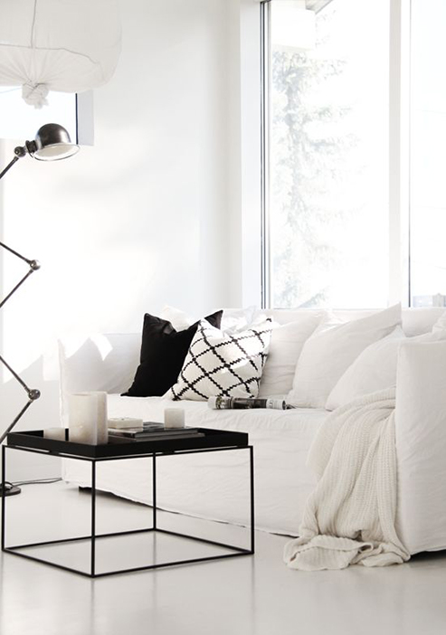
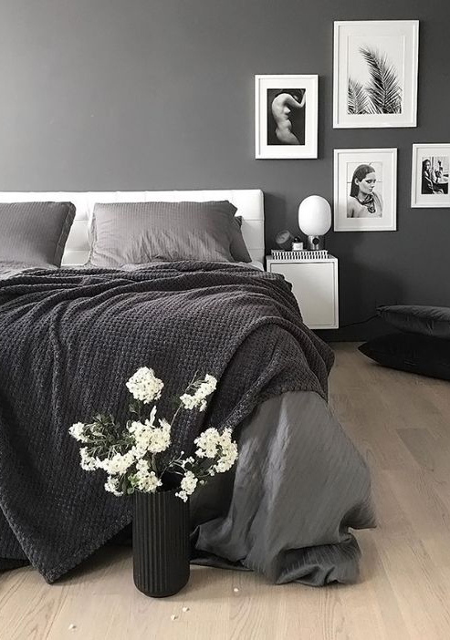
The first thing that we did prior to moving into our house was have the floors sanded back and re-stained (thanks to the advice of one of my girlfriends), which instantly invigorated our home and gave it a light and airy vibe when coupled with a fresh coat of white paint. The flooring gives off a slight warmth, and works really well with the Mid-Century Scandinavian aesthetic that myself and Luke have both been drawn to. And while I’m still pushing for a feature wall somewhere in the house, we’ve opted to add character though carefully selected design pieces, and colour through interiors and decor items.
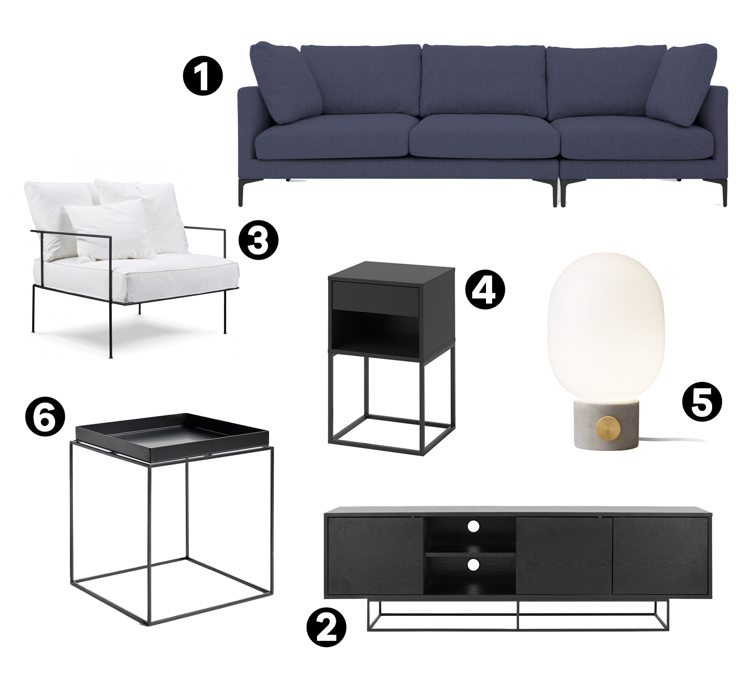
Let’s start by talking about one of the first big pieces of furniture that we’ve bought for the home; a navy couch with a matching ottoman. Most of the doors in our house – aside from those leading into the bedrooms and bathroom – were ripped out at one point; the most noticeable of which is the entrance to the living room, which at one time had a double door entrance. We’re planning to close this off with a black framed window wall with sliding door, and we wanted to pick a couch that nestled into the space to make it feel cosy and inviting. Luke’s been keen on having an L-shaped couch for years, however I’ve never been a big fan of that corner seat, so I spent some time looking for a good compromise. We ended up settling on the Adam couch from Castlery in a beautiful navy hue (1), with black iron legs. This seemed like a great choice because you can effectively customise the shape of the couch to suit the room or your preferences. A navy couch has been on my wishlist for a few years now; as much as I love a minimal colour palette, it can look a little stark, and this felt like an easy way to add a bit of extra warmth into our living space.
The next item on the living room wishlist is a new TV cabinet. While there’s nothing technically wrong with the cabinet we currently have, we bought it as a bit of a stop-gap measure to fill a void. Having champagne taste on a beer budget meant that we had to make a few compromises, and this was one that I was hoping to make good on sometime in the future. And, we’ve spotted a couple of options that we like, though my favourite is something like this (2). It’s simple, with lots of cupboard space, and I think it would work well with the existing decor in our house.
The final item I’d love to add to our living room is a new armchair. I’ve accepted that it’ll be a long time before I can justify another white chair – having three pets means that it wouldn’t stay white for long – so a muted grey seems like a good alternative. I really love this particular style from MCM House (3), and I think this one here is also really striking.
For our bedroom, we’ve gone back to using the IKEA Frosta stools as side tables once again. After coming to the conclusion that we’d like something relatively simple and minimal, with at least one drawer, we have settled on a couple of options. I quite like this style from IKEA (4), however I would love to find something that is a little more robust looking. I’d also really like to get some nice lamps… something with a dimmer built in, and I’ve had my eye on this particular style from Menu (also here) (5). It’s quite a modern design, and they’re a bit of an investment, but I’m particularly drawn to the concrete base and have already gotten sign off for these from Luke so safe to say, it’s only a matter of time before these find their way into our house.
Finally, I’ve been eying up these small side tables from Hay (6) for the last couple of years, and I feel like one of these would look lovely as a side table in the main guest bedroom. The room is already quite light and airy so I’d probably opt for the black version just to add a bit of contrast.
images via pinterest

