
Monochromatic or tonal looks might just be my favourite. It’s the styling tool that I utilise most and every outfit – saturated with colour or muted and calm – feels right within my wheelhouse.
The trick though, is how to make a monochromatic outfit feel interesting. Stop it from falling flat.
Through all my years experimenting with monochrome dressing, I’ve found that there are three key styling pillars that add in that visual element of dimension; shape, texture, and colour.
You may even find that your outfit includes all three, but usually, the ones that feel good will have at least one of these core themes.


Shape
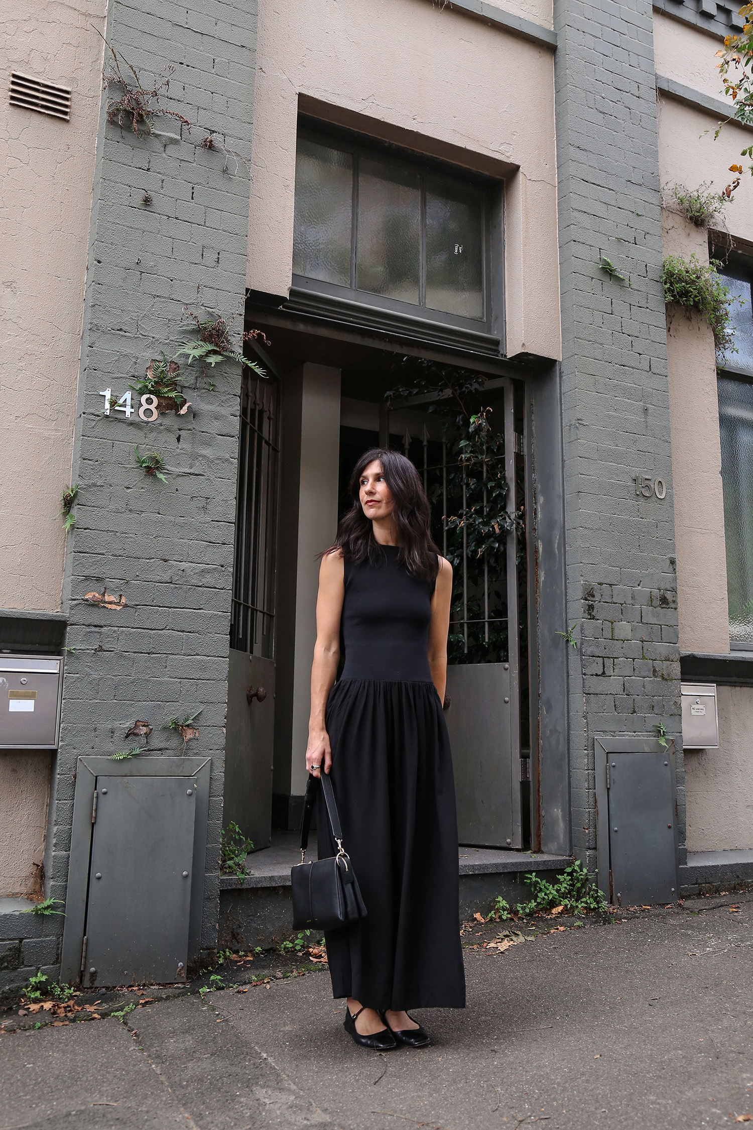
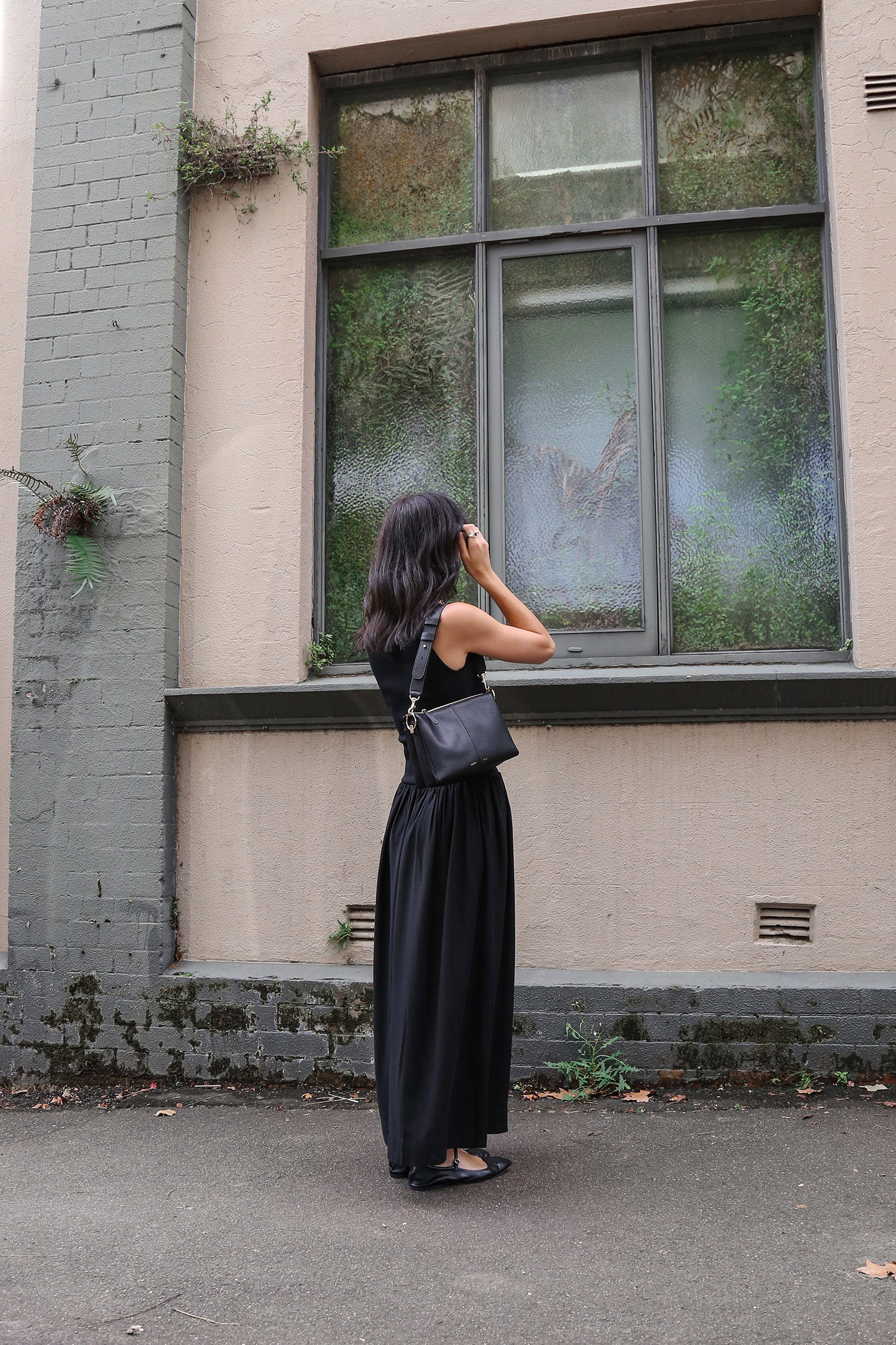
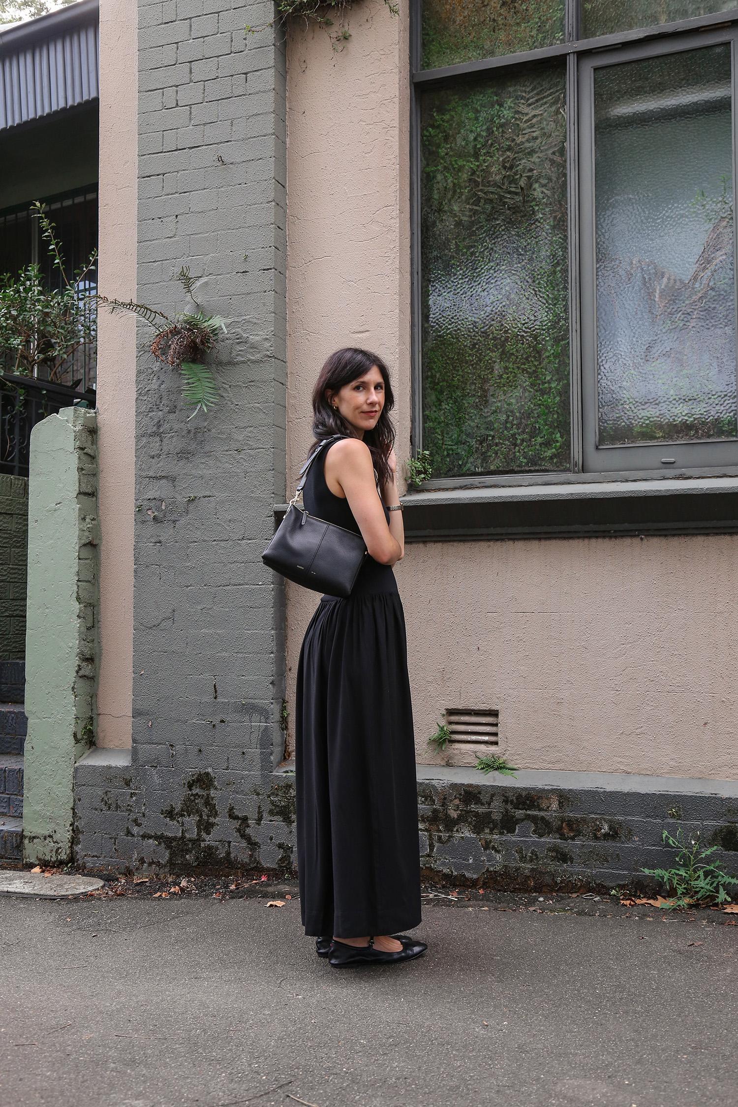
Starting with the first outfit, I wanted to touch on the theme of shape. This could be sharp vs soft lines, slim vs oversized. The silhouette could be exaggerated, sculptural, or strike some as unusual. It could be a design detail of the item itself, or a styling flourish that you’ve intentionally added in. A personal favourite of mine – belting something with volume to create an exaggerated peplum effect.
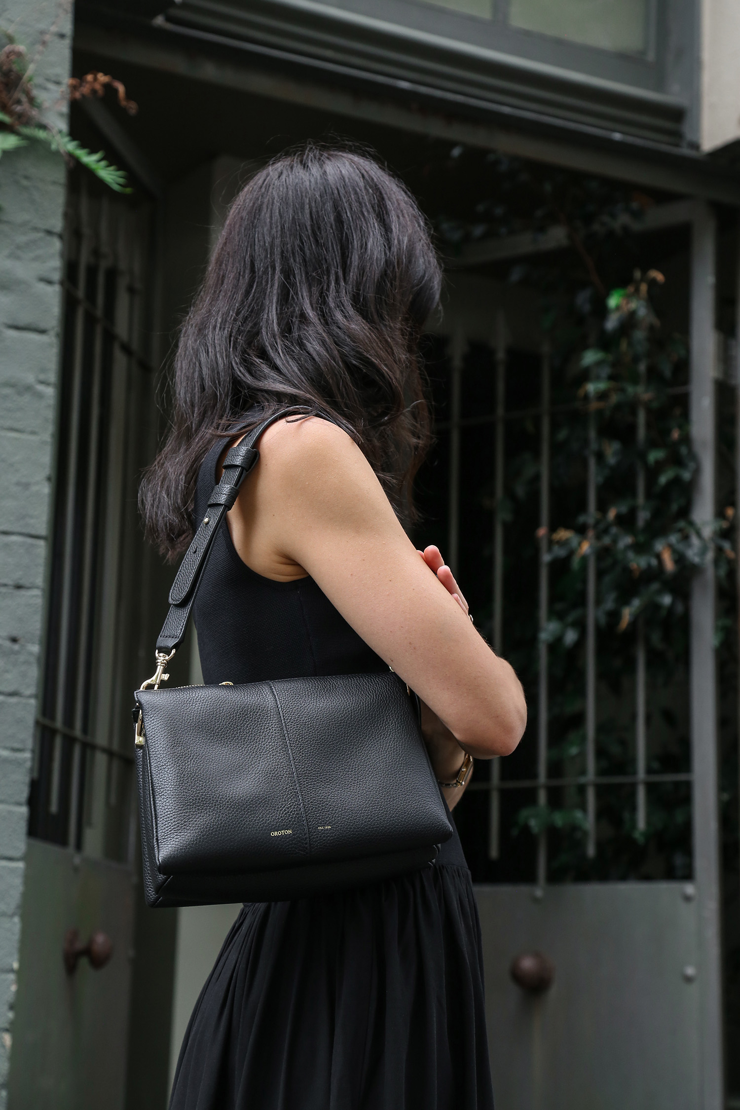
This dress is a slightly more subtle take on shape; the bodice is fitted, designed to sculpt and contour in a thick rib knit. It has body, feels robust. The skirt by contrast has an element of grace and flow. The fabric moves around effortlessly, while also adding in a softness.
Wearing ONTE dress; Oroton bag; Aeyde Maryjanes

Texture
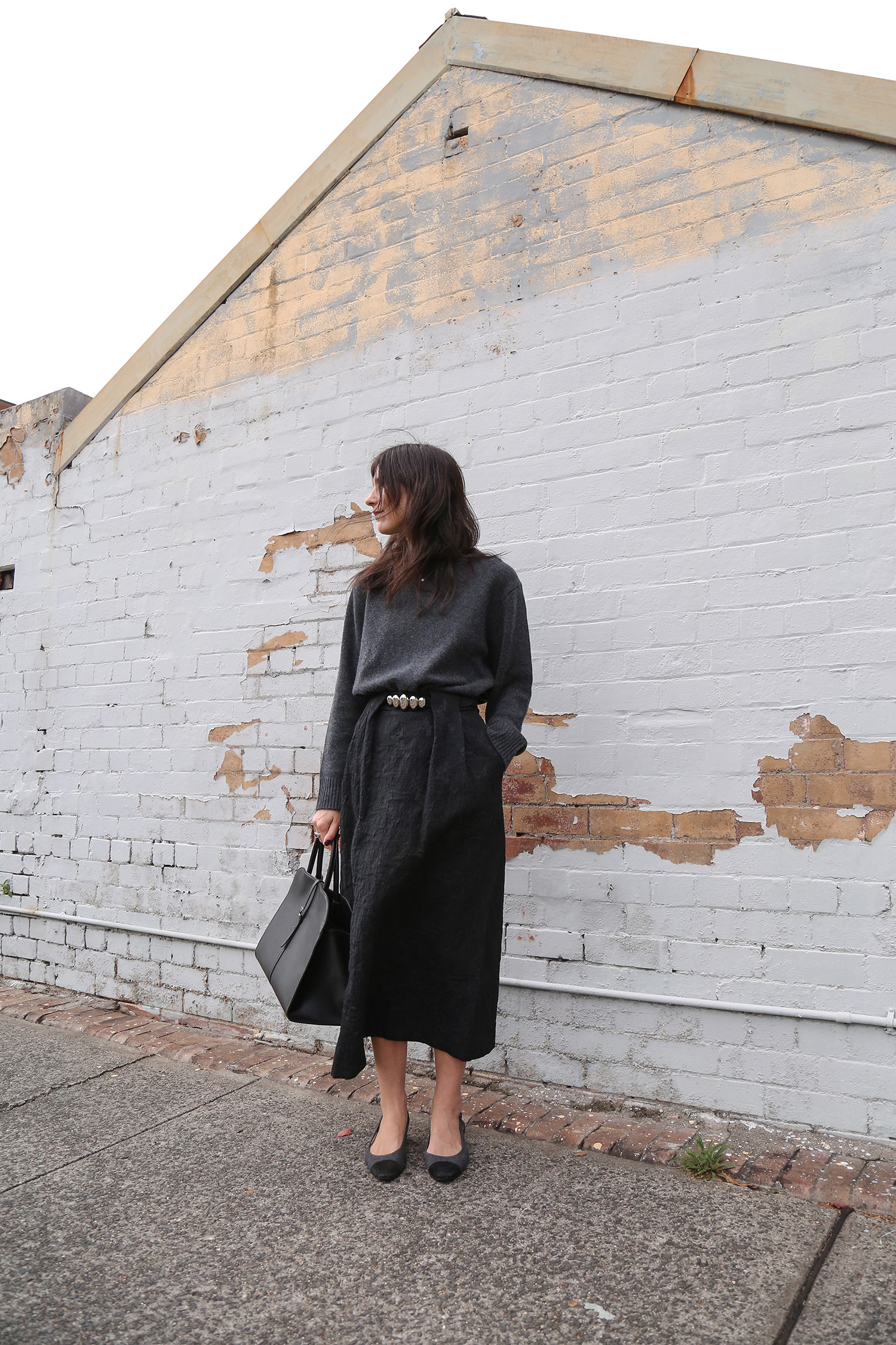
The second theme is texture. A tactile quality to the clothing. Something that distinguishes between the partitions of our outfit. That draws the eye in, in search of a missed detail. Think soft, fuzzy, shiny, glossy, smooth, puckered, silky. A good mix helps to define the outfit, while also adding layers of nuance.
You can see it present in this outfit here. The cashmere knit has a plush quality, whereas the skirt is in an ornate Jacquard with so much depth alone. My bag is a pebbled leather, with a slight shine, and the shoes are a mix of fuzzy wool flannel, and soft suede.
Wearing Quince sweater; Foemina skirt; Vaneli two tone pumps; MONOROW bag (review here + it’s 10% off with MADEMOISELLE10)

Colour
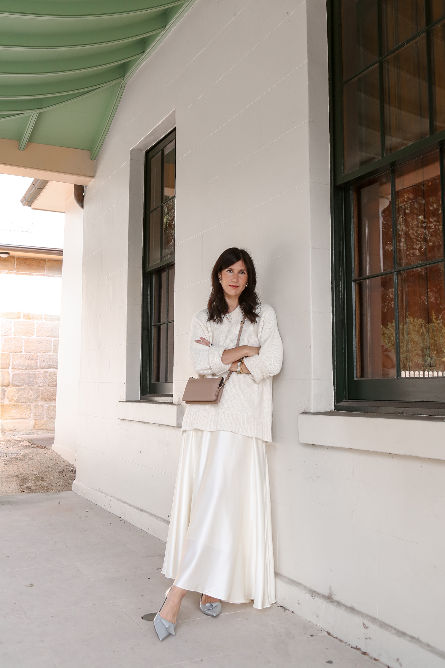
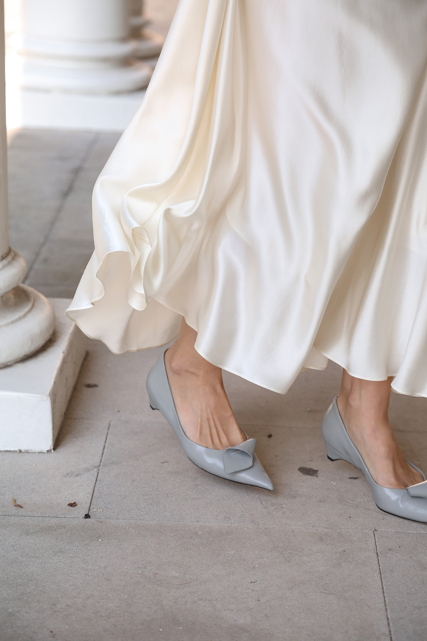
Final theme; colour. And there’s a handful of ways that this can play out in an outfit. Namely, the balance between warm and cool. For harmony, you’ll want to pick one or the other (though neutrals that straddle that middle ground tend to work too). It could be how you incorporate prints – drawing in on commonalities of the colours present in the print for your outfit. Maybe it’s how you play with brights; opting for varying degrees of colour intensity within your outfit (think shades of blue, or red). Or maybe it’s how you add in colour against a neutral base through accessories (think bags, shoes, earrings and even makeup).
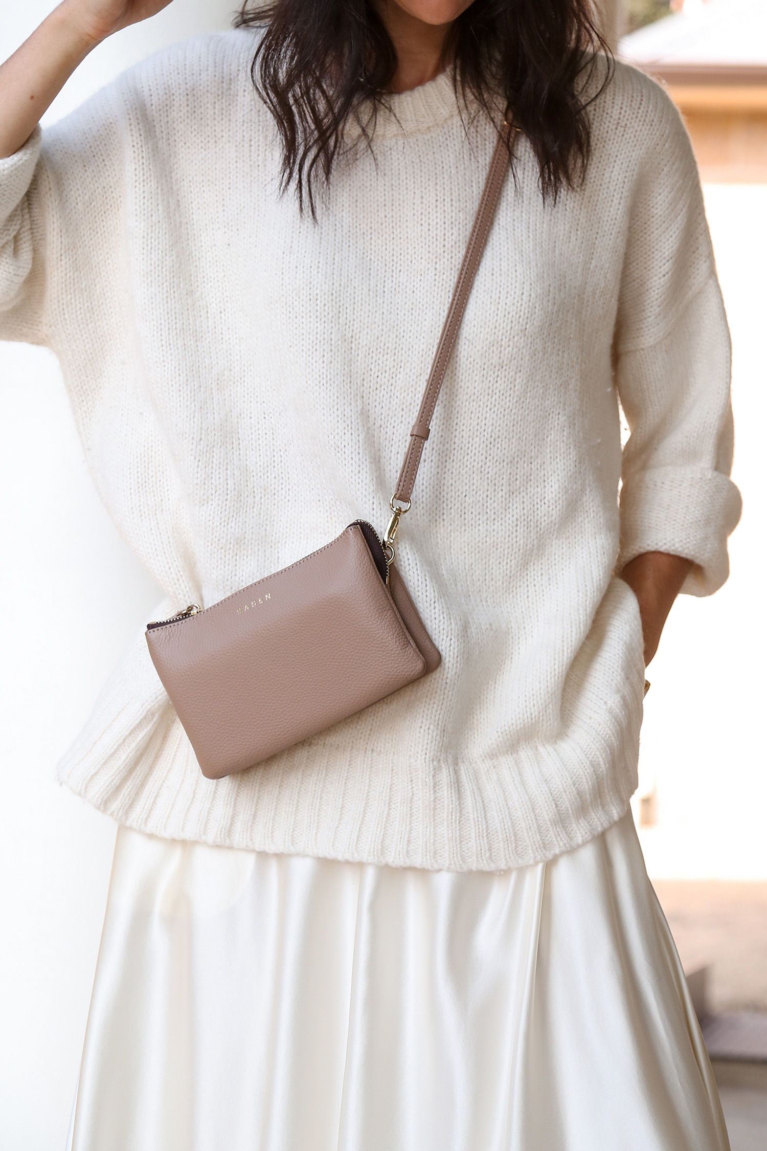
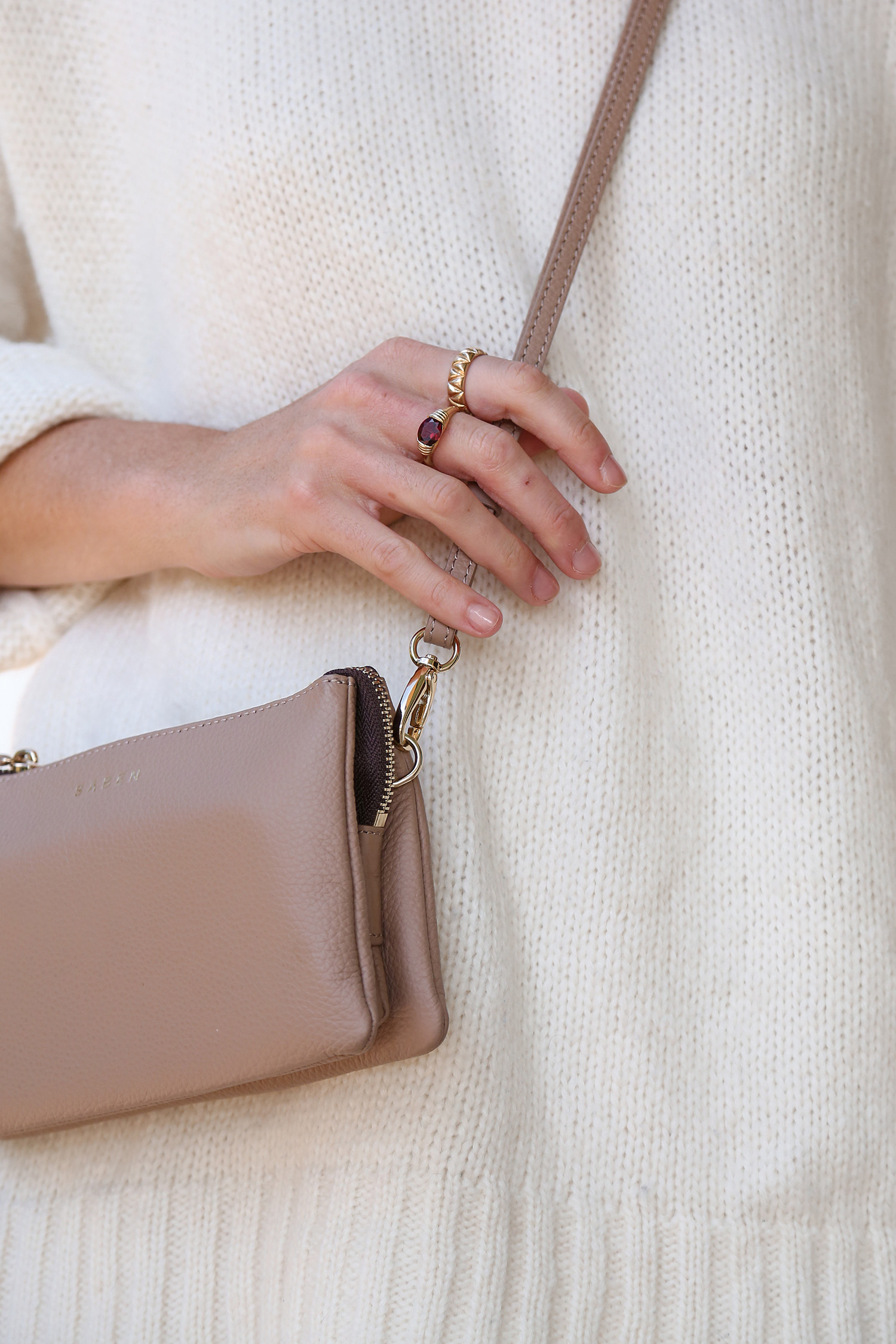
You can see how I’ve chosen to use colour here in this final look; all pieces sit on the neutral to cool end of the spectrum, from clothing items to accessories.
Wearing Jenni Kayne sweater; LILYSILK skirt (20% off with JL20); Tony Bianco shoes; Saben Tilly Bag (15% off with JAMIELOVESSABEN15)

